top of page
WayneTech Branding Project
As a college project, I was required create a branding kit for a company expo event. Being a Batman fan, I decided to redesign a classic tech company from the comics: WayneTech.
This company was a lot of fun to design and it came together to create a very professional-yet-aesthetic brand that reflected a wealthy company that cared about those who supported it.
Located in Gotham, New Jersey, this fictional company is owned by billionaire Bruce Wayne and is a well-known tech development company, passed down to Bruce from his father. This company is about more than just development of technology; this company represents a legacy and pushes towards helping people. The company drives towards developing technology that can help people whether it be computers, army weapons, or food
The demographic age, ethnicity, and gender of a high-tech worker is, on average, white males around the age of 38. Also, the fictional company I was designing for is a very wealthy company, with the majority of billionaires being white males who are middle-aged or older. However, this company also strives to serve the general populous and therefore is a combination of these factors. The brand logo and design is made to reflect the wealthy aspect of the company, but the brand also works towards being friendly towards new hires and to serve the average population.
My goal for the project was to create an elegant company with a timeless look. This company shouldn’t look unwelcoming, but rather established and well-known. To best create a fulfilling design for the project, the business needed a black and yellow color scheme with white always on standby for highlight.
Through the development of this branding kit, a future brand has been created for this company. Future designs for this company will be easily streamlined through use of the branding kit, with colors, logos, and fonts created to be easily used in any design. The project was a great use of design skills and practice to prepare for future projects.
Project type
Branding

01
WayneTech Branding Project
01
The Sketches
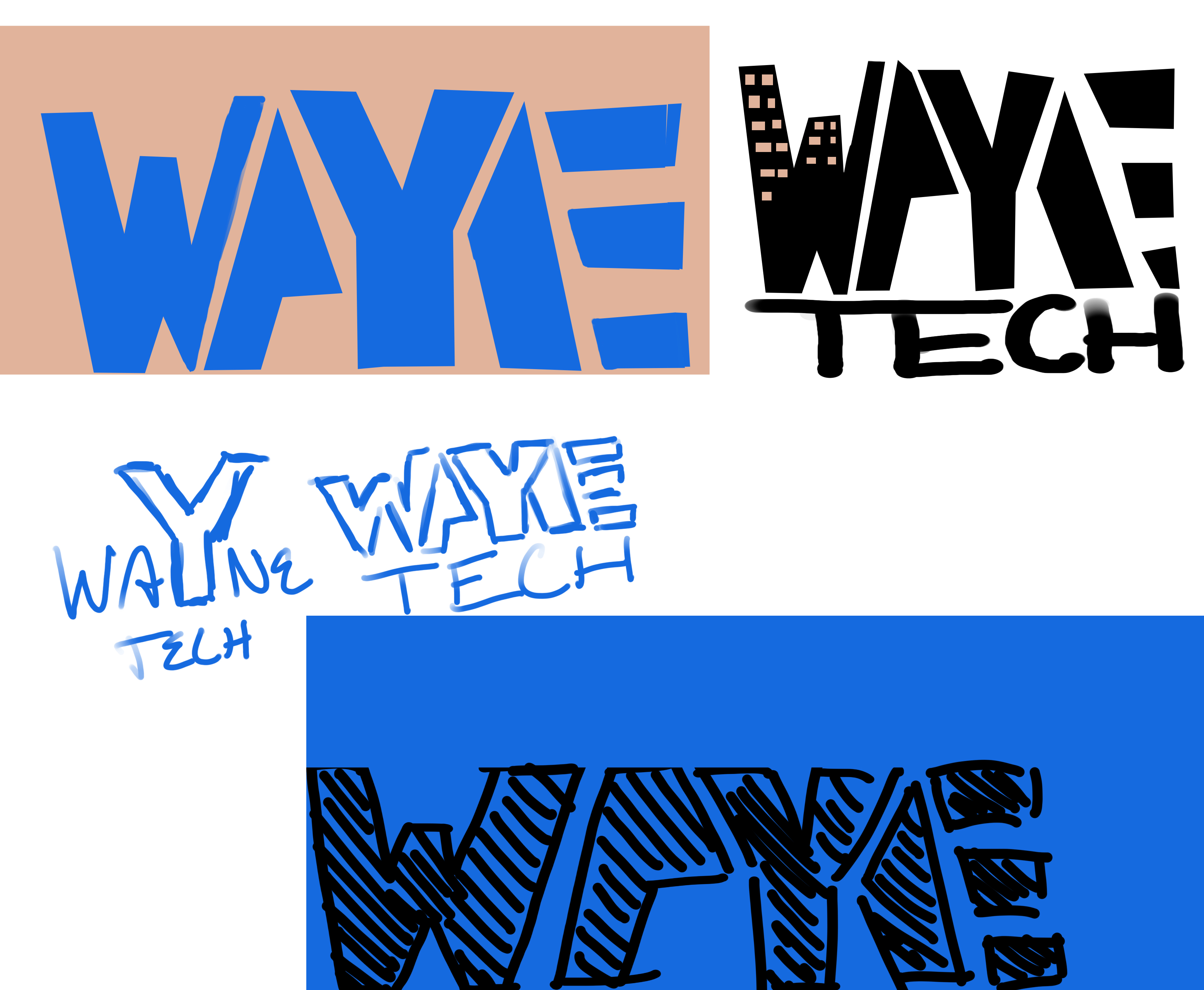
Because I was rebranding a fictional company that already existed, I wanted to be careful not to make a logo too similar to existing ones. So, as the process began, I created sketches of possible logo designs, leaning heavily towards a wordmark logo. The original WayneTech designs were very bold and blocky, while some had an elegant icon complimenting it. However, I wanted a design that had a bold and unique, yet modern and minimalistic look that could be easily recognized.

02
Primary Logo
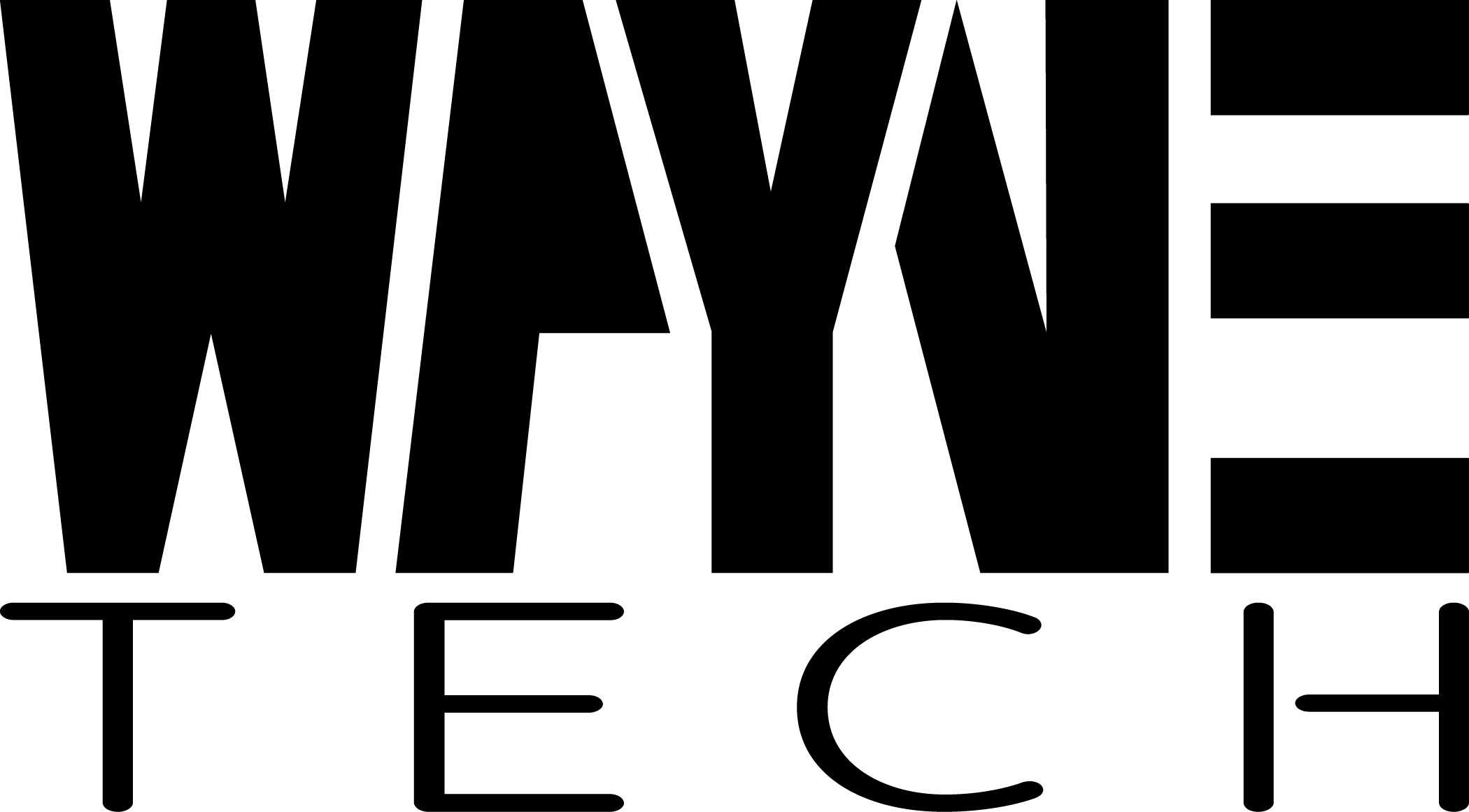
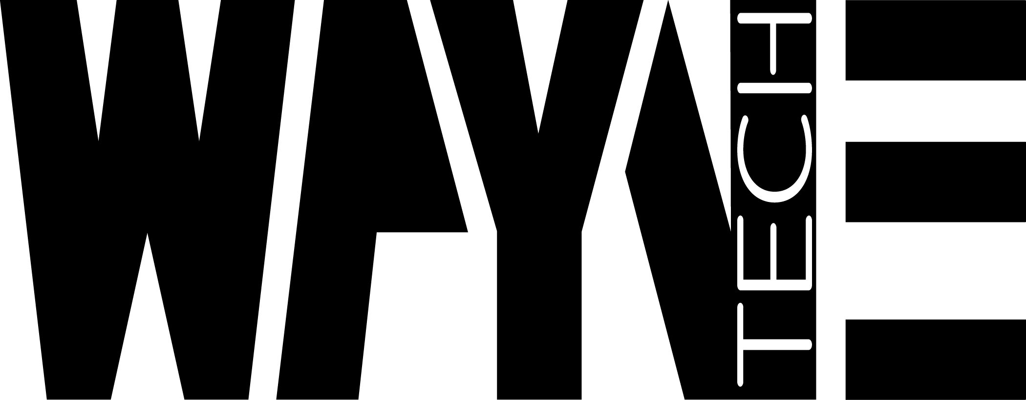
The design idea came fairly quickly when sketching, and I was able to vectorize it in Illustrator, making it clean and sharp. For the second word in the logo, I chose an appropriate font to highlight the blocky main text of the logo by being more thin and rounded. With this design, I developed a WayneTech logo that built upon itself.

03
White Logo
Colors were swapped to create a white primary logo, which was perfect for designs that required a black background.

04
Alternate Lockup
The alternate lockup design is similar to the primary logo, but much more compacted, with “tech” being placed inside of the N from “Wayne.” This design is created to be more compact yet still retain the main idea and theme.

05
Moodboard
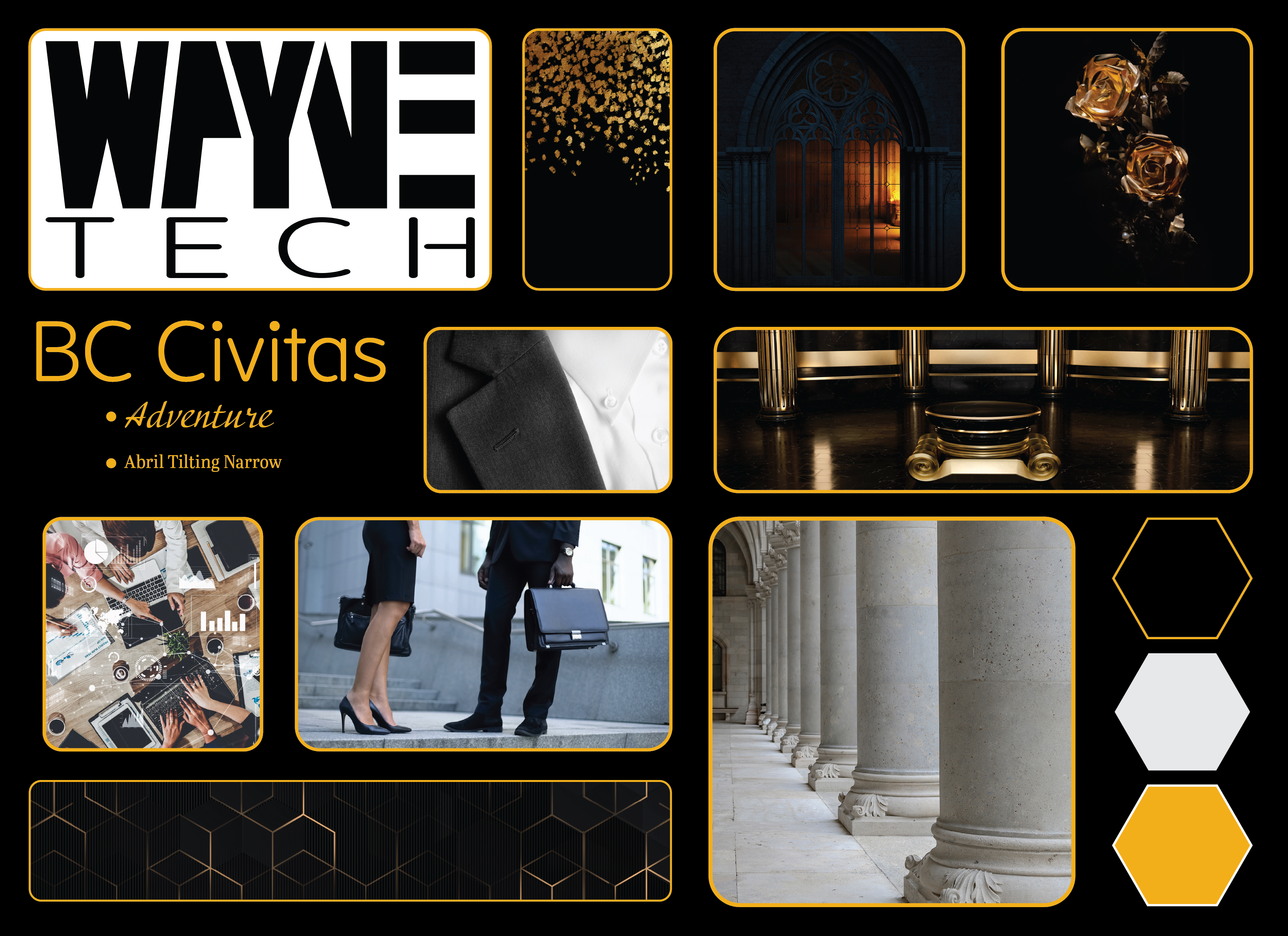
For this design, I created a mood board to represent the company. In the mood board, I included a color scheme, fonts, images that represented the old money business atmosphere of the company, and images that captured the aesthetic.

06
Typography
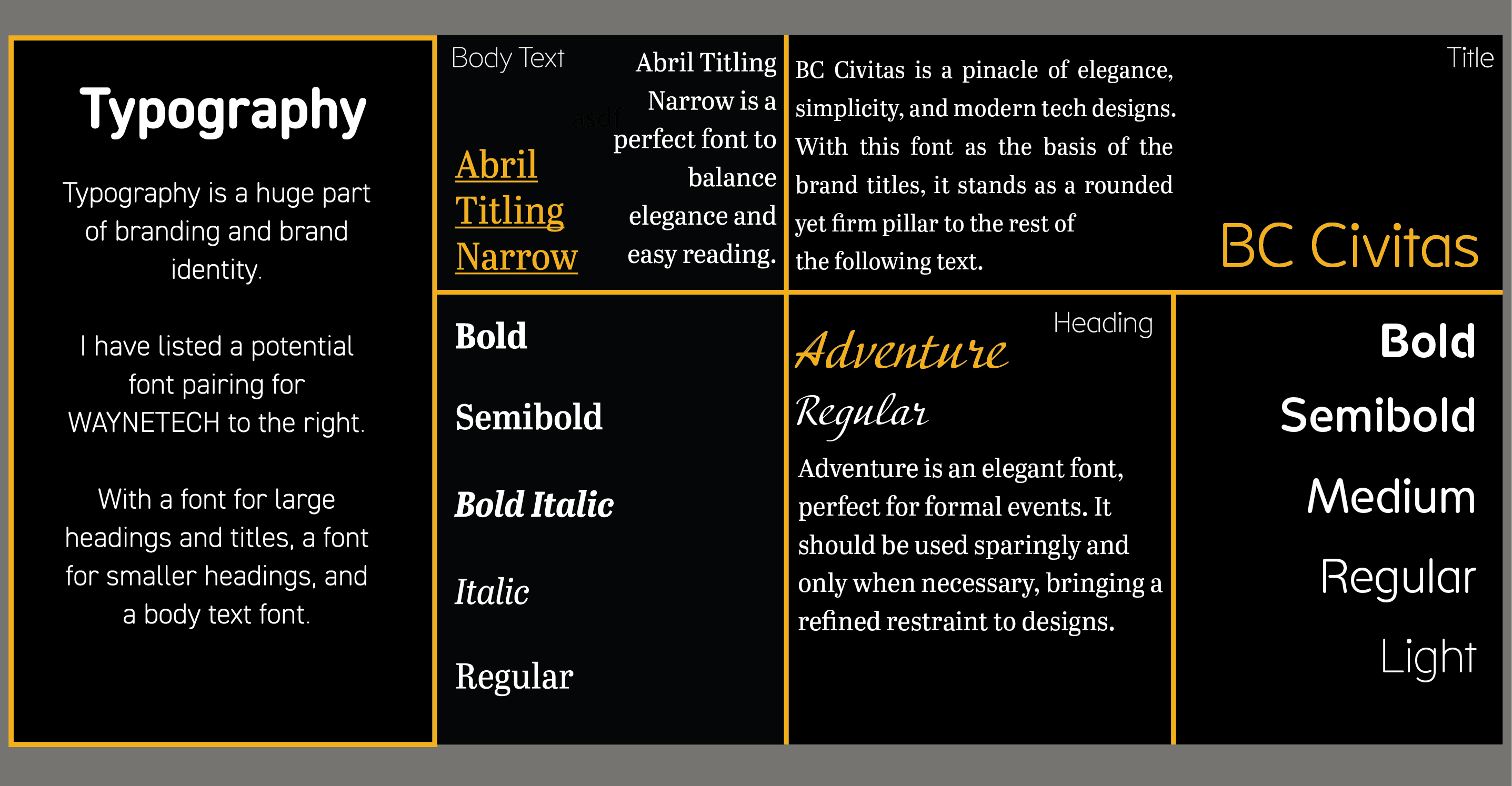
The typography was chosen carefully to create an easy-to-read, business-like typography brand that carried a large title font, a familiar yet formal body text, and an elegant header. The title font is the same as the font used for the word “tech” in the logo design.

07
Color Palette
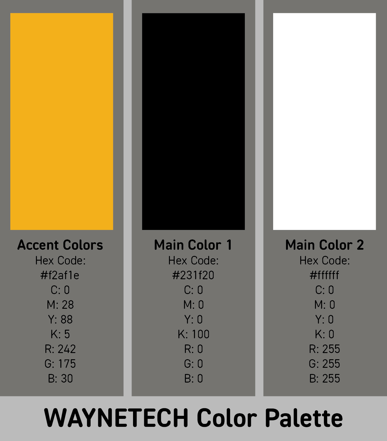
Black and gold was my obvious go-to with this design. Not only does it create a formal design with a friendly color, but it also calls back to the Batman suit created with a black suit and gold highlights.

08
Wordmark
I created an icon that consisted of the W from “Wayne” and a line above the letter that represented the T from “Tech.” This simple wordmark is both recognizable and scalable.

09
Yellow Wordmark
Using the yellow-gold brand color, a secondary wordmark is perfect when a design needs a spark of color.

10
Pattern
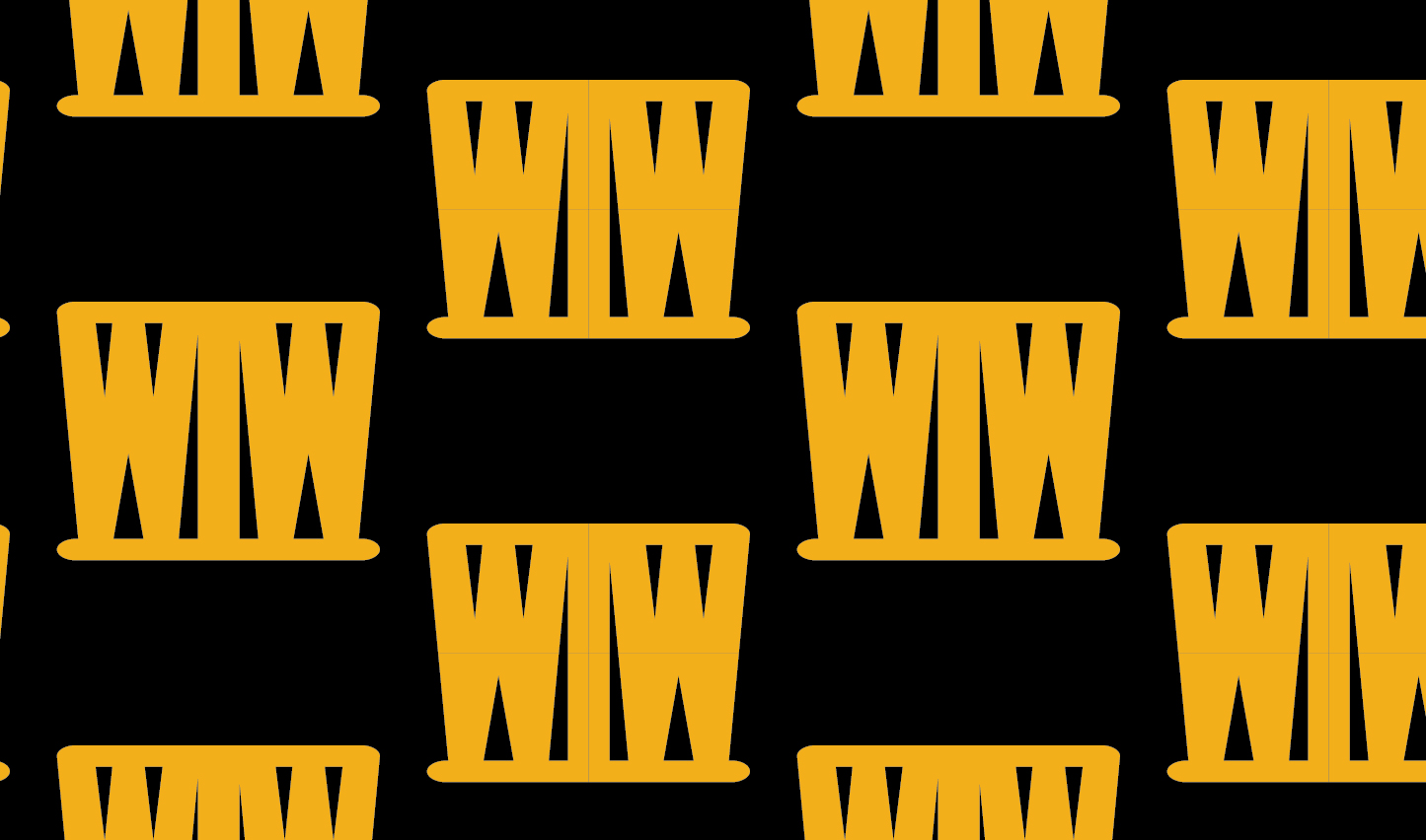
The brand pattern was fun to make. Through combining two W’s and two T’s to create a letter-constructed top-hat, a unique and enjoyable pattern was created. Without having a sense of superiority, the pattern displays elegance, while maintaining a sense of warmer atmosphere with a deep yellow color and rounded corners.
11
Book Mockup
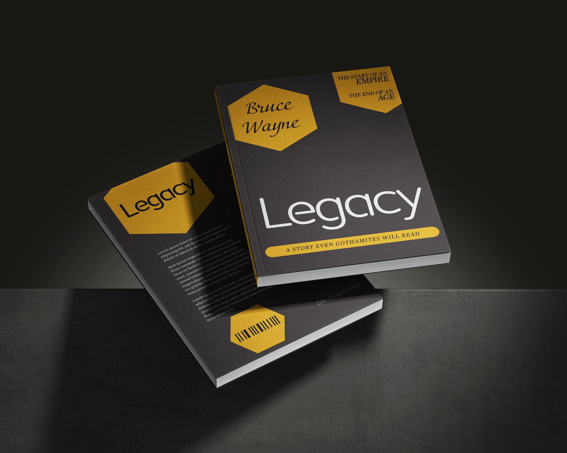
This book mockup was designed with the text and colors in the branding kit, with yellow shapes mimicking the shapes on the billboard. The book contains the needed information, while retaining slight humor mixed with formality.

12
Social Media Post Mockup
For media advertising the event, I created a social media post and a billboard. In addition, I created a design for a book that could be sold at the expo.
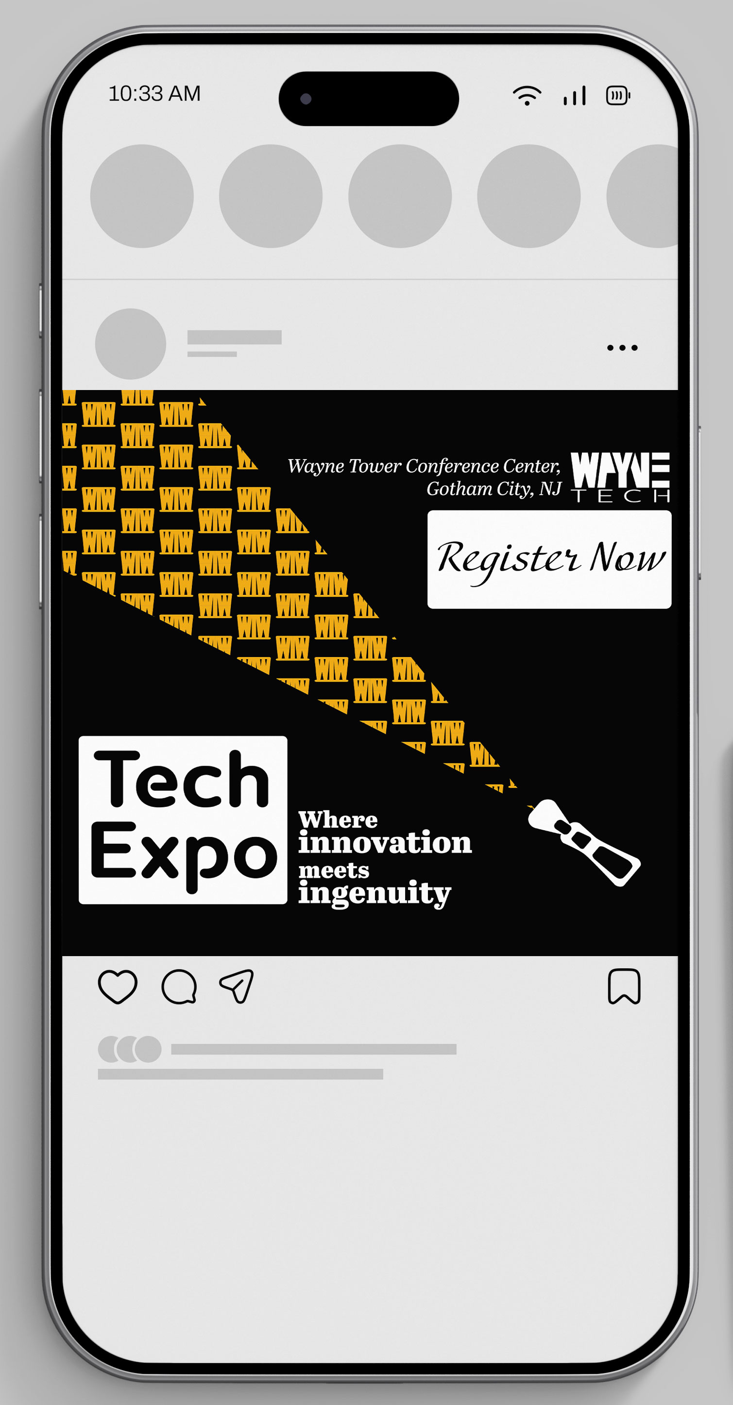
This social media post was designed for Facebook, with easy-to-read text and a unique graphic consisting of a zipper unzipping the black background to reveal the WayneTech pattern underneath.
This social media post was designed for Facebook, with easy-to-read text and a unique graphic consisting of a zipper unzipping the black background to reveal the WayneTech pattern underneath.

13
Billboard Mockup
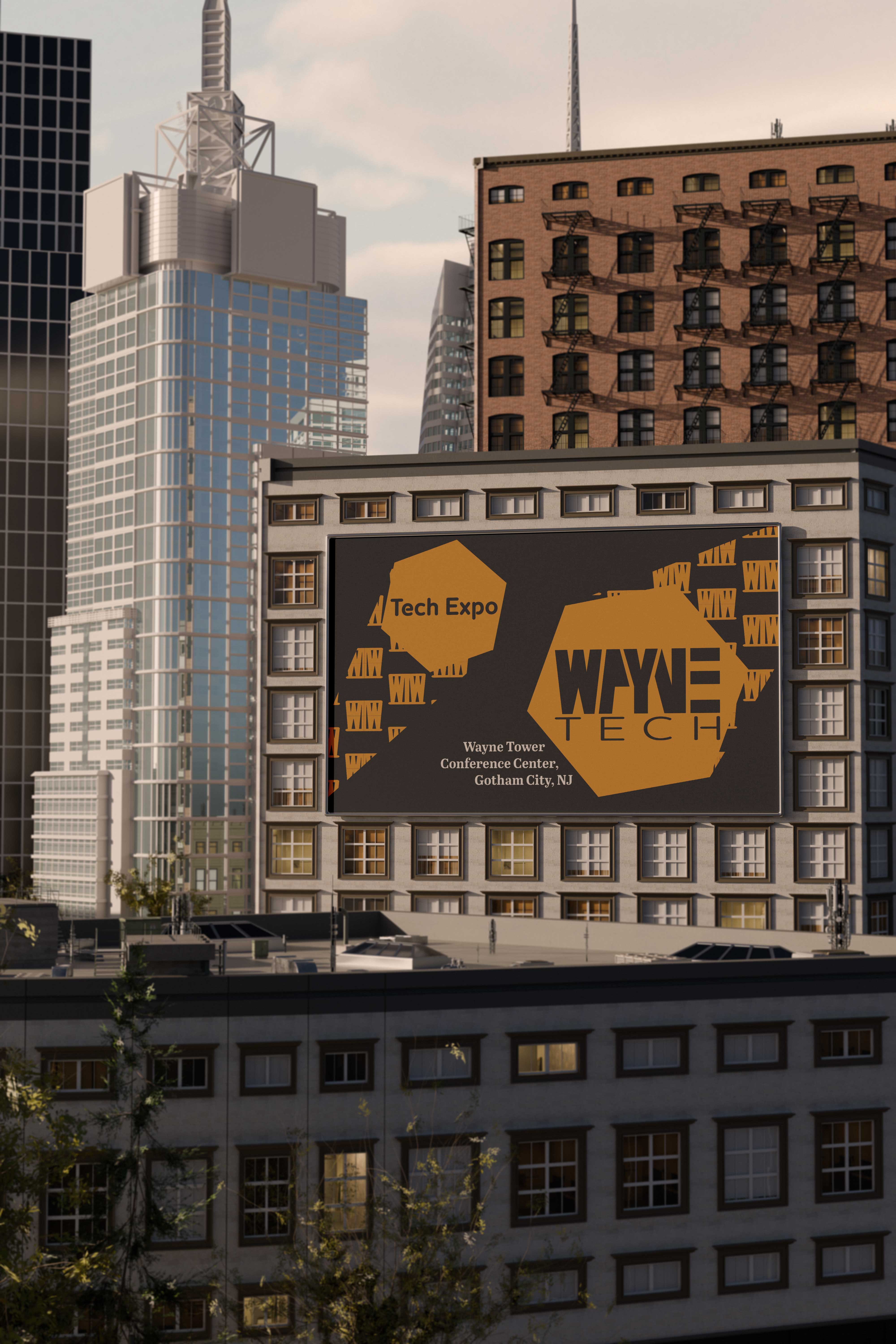
This billboard ad was created to be very simple yet draw a viewer’s eye. The graphics are designed to look like spotlights shining down on the words, while the words are designed to be easy to read at a glance.



Want ads done for your brand?
Contact the designer below to get further information on ad campaign information!
bottom of page