top of page
Press Play Records Branding Project
Press Play Records is a fictional vinyl store that specializes in both selling records and hosting private listening rooms where you can listen to the records in-store. Local and modern, this company wanted an authentic look with that welcomed new listeners.
Some of the brand attributes that were worked out between me and my classmate, who was in charge of this fictional company, were “modern, open, welcoming, authentic, and creative.”
The business wanted a minimalistic, dark-toned design for a vintage type of business, giving a modern twist to a classic business while keeping the vibe of the hobby type. They wanted to be an all-inclusive, trustworthy, welcoming environment where you aren’t judged for the music you like and buy.
This fictional company was located in Madison, Wisconsin, this company is targeted towards men and women in their 20s-40s who are just entering the hobby of record collecting. It offers affordable prices as well as new records along with the old. The company wanted their store, staff, and brand to convey the feeling and aesthetic of the hobby rather than just be a record store. Hypothetical competition included small (real life) record companies in Madison that provide vinyl sales. However, these companies often have very outdated logos and websites and Press Play Records wanted a modern and applicable logo.
The goal for this project was to create something modern, darkly colored, and fresh while retaining the feel of a record company and making the hypothetical client happy. This was to help create a starting brand for a newer company.
To create something that stood out yet stood firm, the company needed a sturdy logo that also incorporated a logo inside of the main logo to create something meshed together. In addition, with the color scheme requested of the “client,” the red was a perfect highlight for the black and tan colors. All of these elements were combined to create a logo fit for a real-company brand.
Project type
Branding
Date
Feb - March 2026

01
Press Play Records Branding Project

01
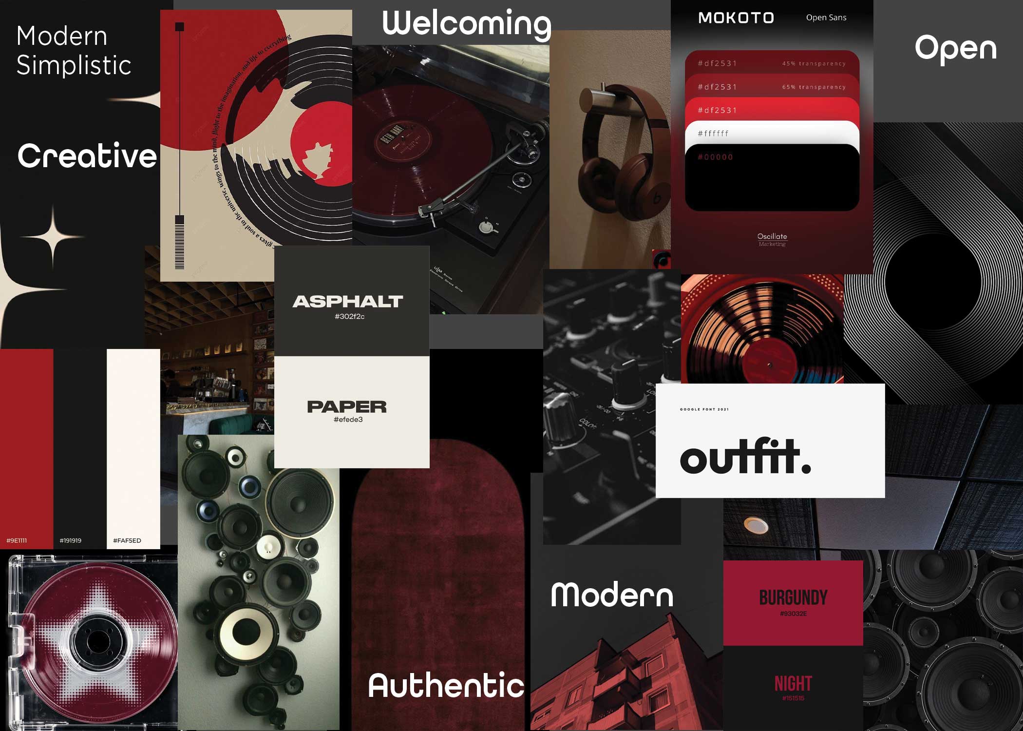
Moodboard - Modern Simplistic
As the project began, I presented the client with three moodboards of collected color schemes, fonts, and images that I thought the client might like.
This moodboard contained bold, yet rounded, text and many circles in the images collage.
This moodboard contained bold, yet rounded, text and many circles in the images collage.

02
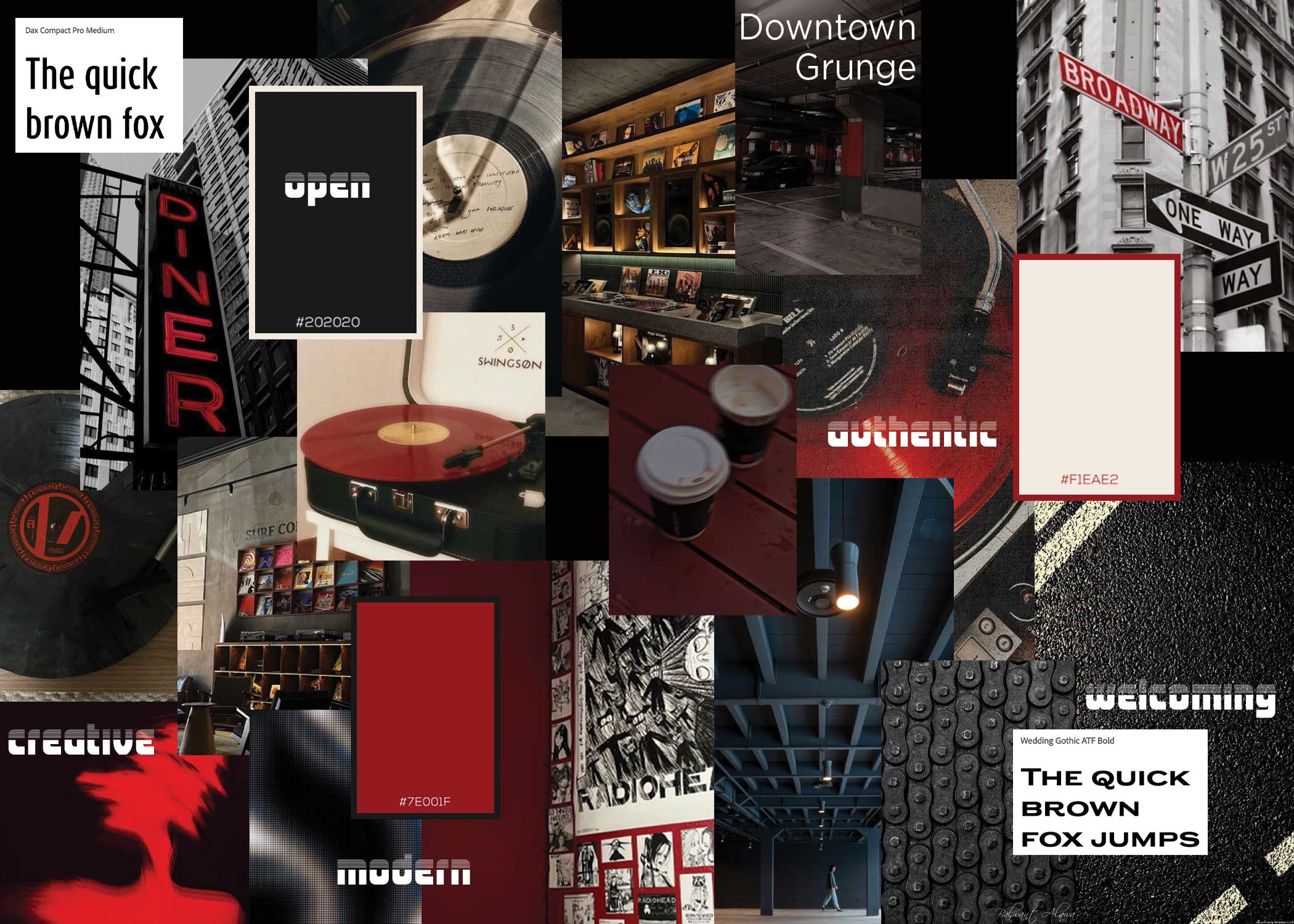
Moodboard - Downtown Grunge
This moodboard contained more unique fonts and a more downtown feel to the aesthetic the client wanted.
Because the client knew from the start that he wanted a black, red, and white color scheme, I attempted to find multiple color pallets that contained these colors but were also different from each other.
Because the client knew from the start that he wanted a black, red, and white color scheme, I attempted to find multiple color pallets that contained these colors but were also different from each other.

03
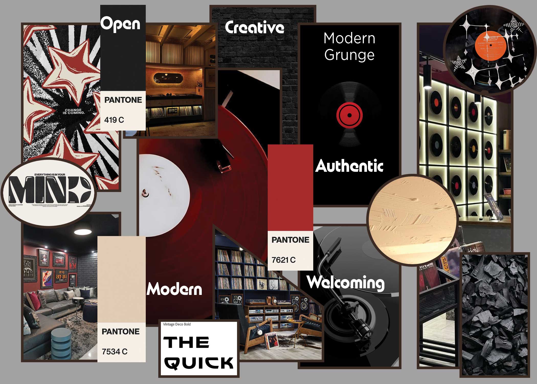
Moodboard - Modern Grunge
Clean yet dark, this design contained a very modern and simple aesthetic.
This design feels like when you take a new vinyl out of the sleeve and it's sides are completely clear of scratches and you know it will provide you with exactly what you wished for.
This design feels like when you take a new vinyl out of the sleeve and it's sides are completely clear of scratches and you know it will provide you with exactly what you wished for.

04
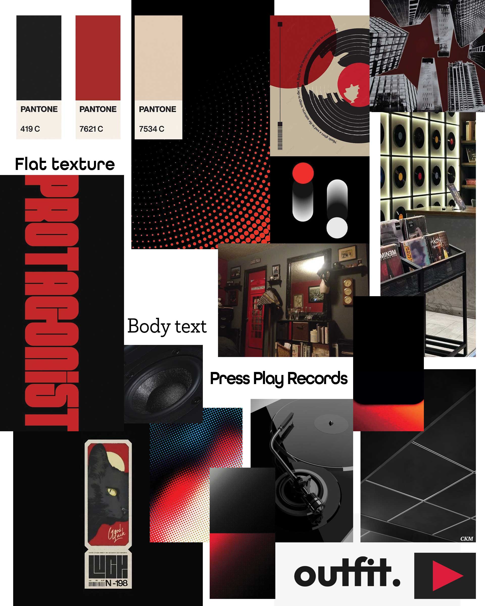
Moodboard - Final
This moodboard was a collage created after receiving client feedback from the first three moodboards. The client wanted a very modern, clean look, with bold letters and a color scheme that I presented in the modern grunge moodboard.
So I pulled together more images, some new and some from the previous boards, to create a new moodboard that further fit the aesthetic that the company wanted.
So I pulled together more images, some new and some from the previous boards, to create a new moodboard that further fit the aesthetic that the company wanted.

05
The Sketches
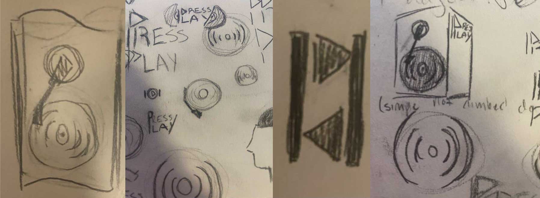
The sketching process was full of tiny speakers and vinyls as I wanted a logo with both words and an icon that incorporated what the brand was, not just who. Some sketches were experimental and others were more direct. With direct colors, a minimalist design, and a modern spin on a vintage hobby, the sketches finally arrived at a speaker design that was close to what was used in the final project.

06
Presentation Logos
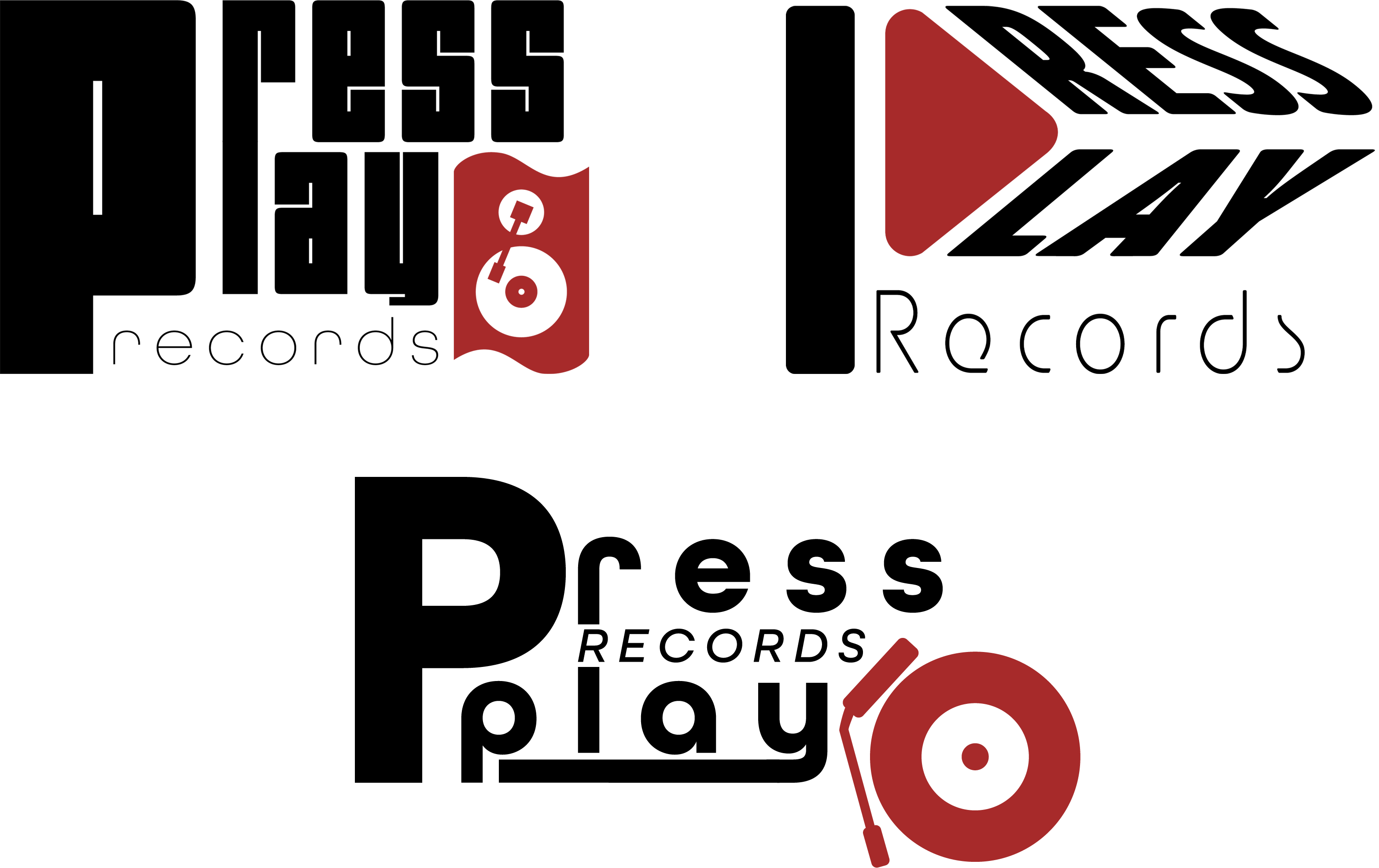
To provide the client with options, three logos were created and presented in a powerpoint along with icons, black and white alternatives, alternate lockups, sketches, process timelines, and mockups for each of the three logos.
In the end, the client chose the top left logo while requesting a few minor changes.
In the end, the client chose the top left logo while requesting a few minor changes.

07
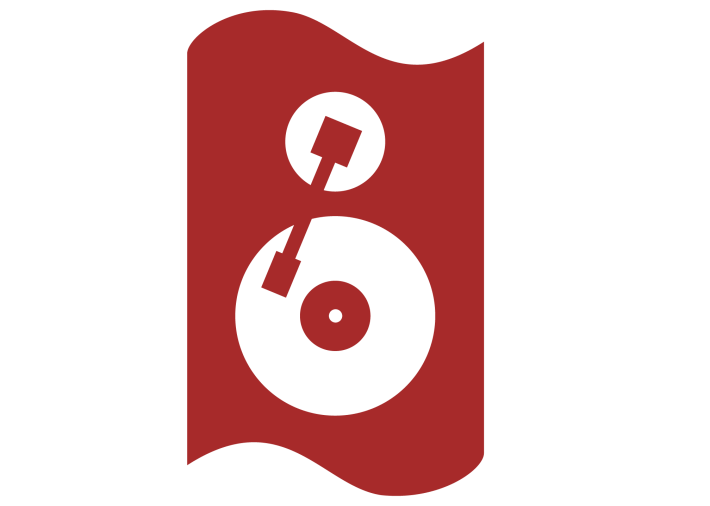
First Icon
The first icon was created as a speaker that doubled as a record player. The edges were designed curved to add better variety to a blocky wordmark.

08
First Wordmark
During the moodboard stage, the client pointed out an image that I included that contained a certain style of text that he wanted the logo use. Taking a font that carried a similar style, I created a bold wordmark with a rounded sub-head text underneath.

09
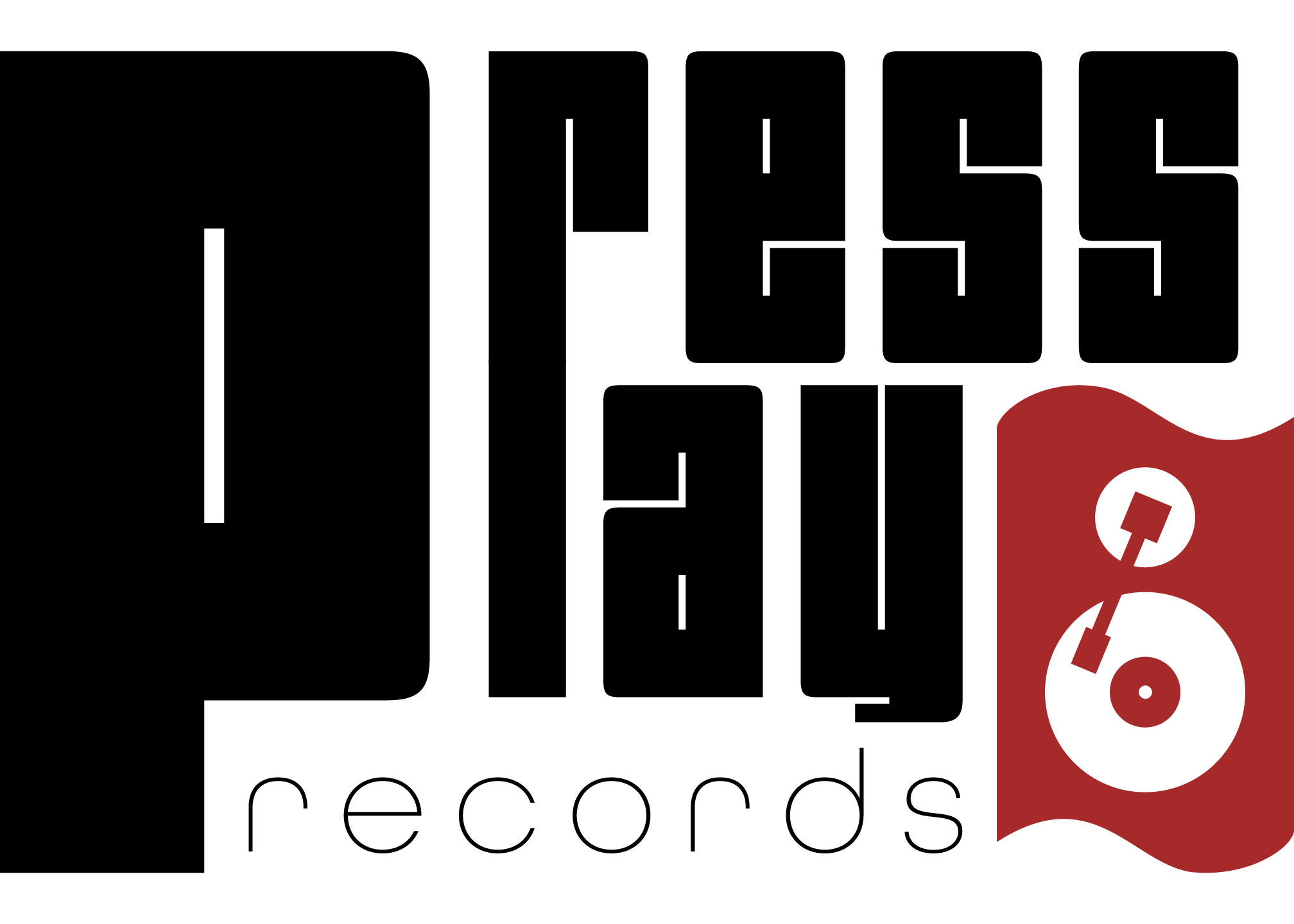
Winning Presentation Logo
To create the logo that the client liked the most out of the three, I combined the blocky text with the speaker icon, the rounded sides balancing off the blocky stature of the wordmark.

10
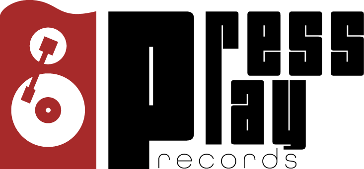
Alternate Lockup
The alternate lockup design remains both scalable and recognizable, while also being different from the primary logo.
Flying off of the side of the wordmark like a flag, the speaker icon is enlarged and place so that it's right corners align with the large letter of the logo.
This design would be perfect for the side of a pen or on the side of a truck. With the structure of this logo, it's easily applicable to many different mediums.
Flying off of the side of the wordmark like a flag, the speaker icon is enlarged and place so that it's right corners align with the large letter of the logo.
This design would be perfect for the side of a pen or on the side of a truck. With the structure of this logo, it's easily applicable to many different mediums.

11
White Logo
A white logo to fit perfectly over any black background while retaining it's design.

12
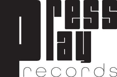
Black Logo
An all-black logo, perfect to fit over white pages or to place as a miniature logo.

13
Icon
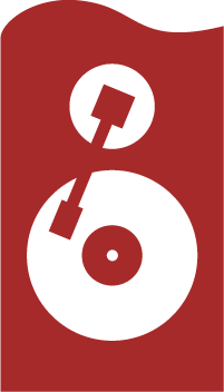
The final icon was created by flattening out the base of the speaker to better fit with the logo.
The variety of shapes creates a unique visual that's recognizable from a distance and close up.
The variety of shapes creates a unique visual that's recognizable from a distance and close up.

14
Red Icon
Using the brand red is the obvious choice to create a visually striking icon that stands out through both color and variety in shapes.

15
The Pattern
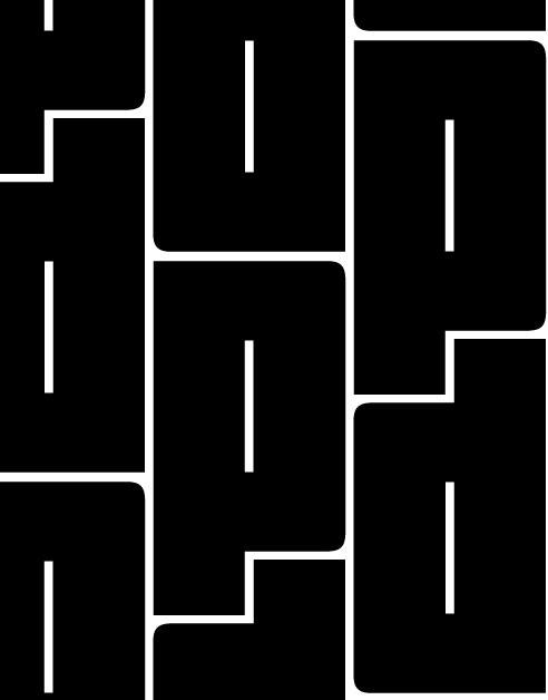
Using the giant first letter of the logo, I created a flipped version of it and fit them together into a compact pattern. This creates a pattern that is easily recognizable, even at a low opacity.

16
Sticker Mockup
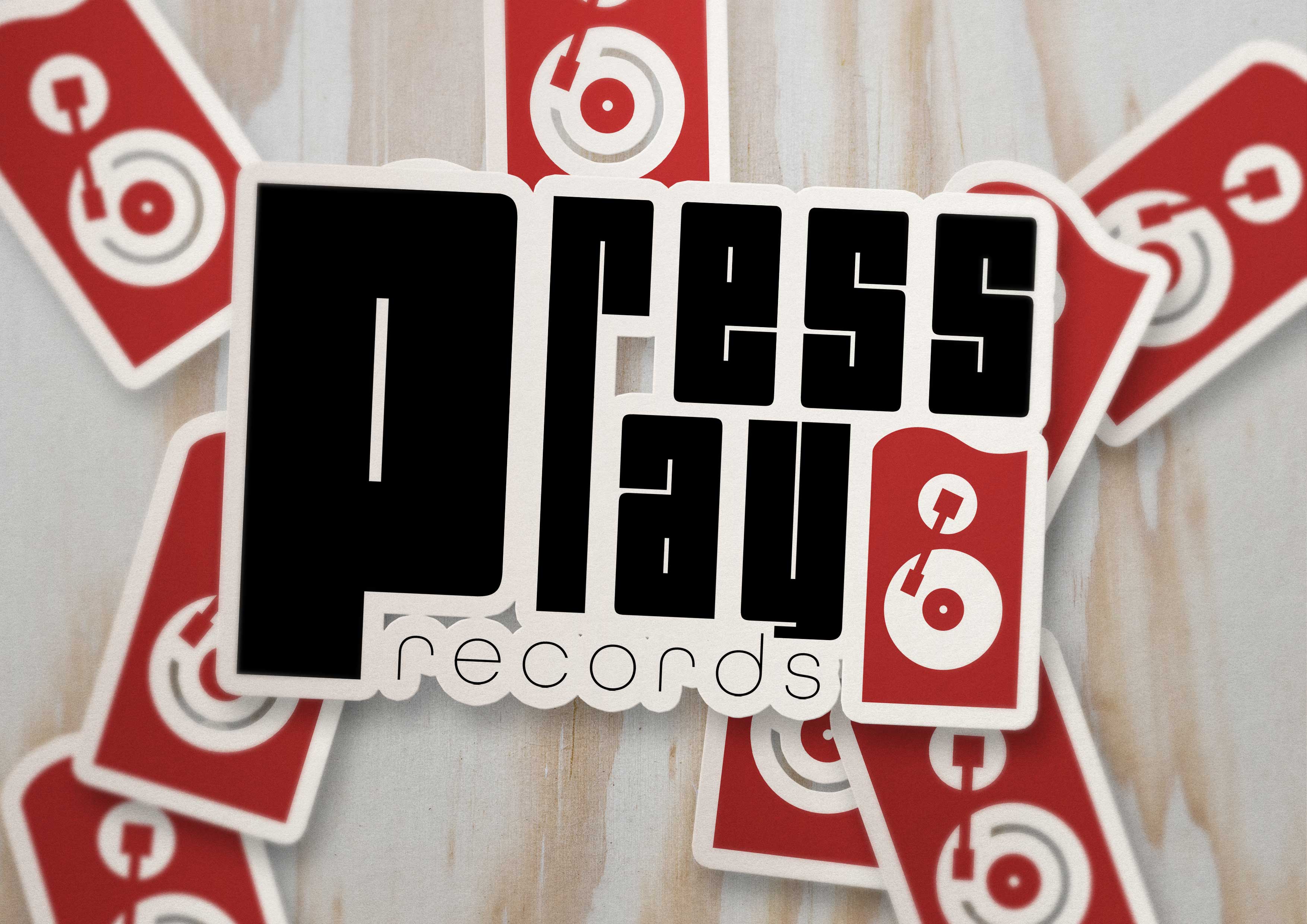
A group of stickers perfectly displays how versatile this logo really is. Bold, scalable, and eye-catching, this logo is perfect for a variety of options.
With icon stickers in the background and a primary logo sticker at the front, it displays that multiple elements of the logo can be a sticker.
With icon stickers in the background and a primary logo sticker at the front, it displays that multiple elements of the logo can be a sticker.

17
Sign Mockup
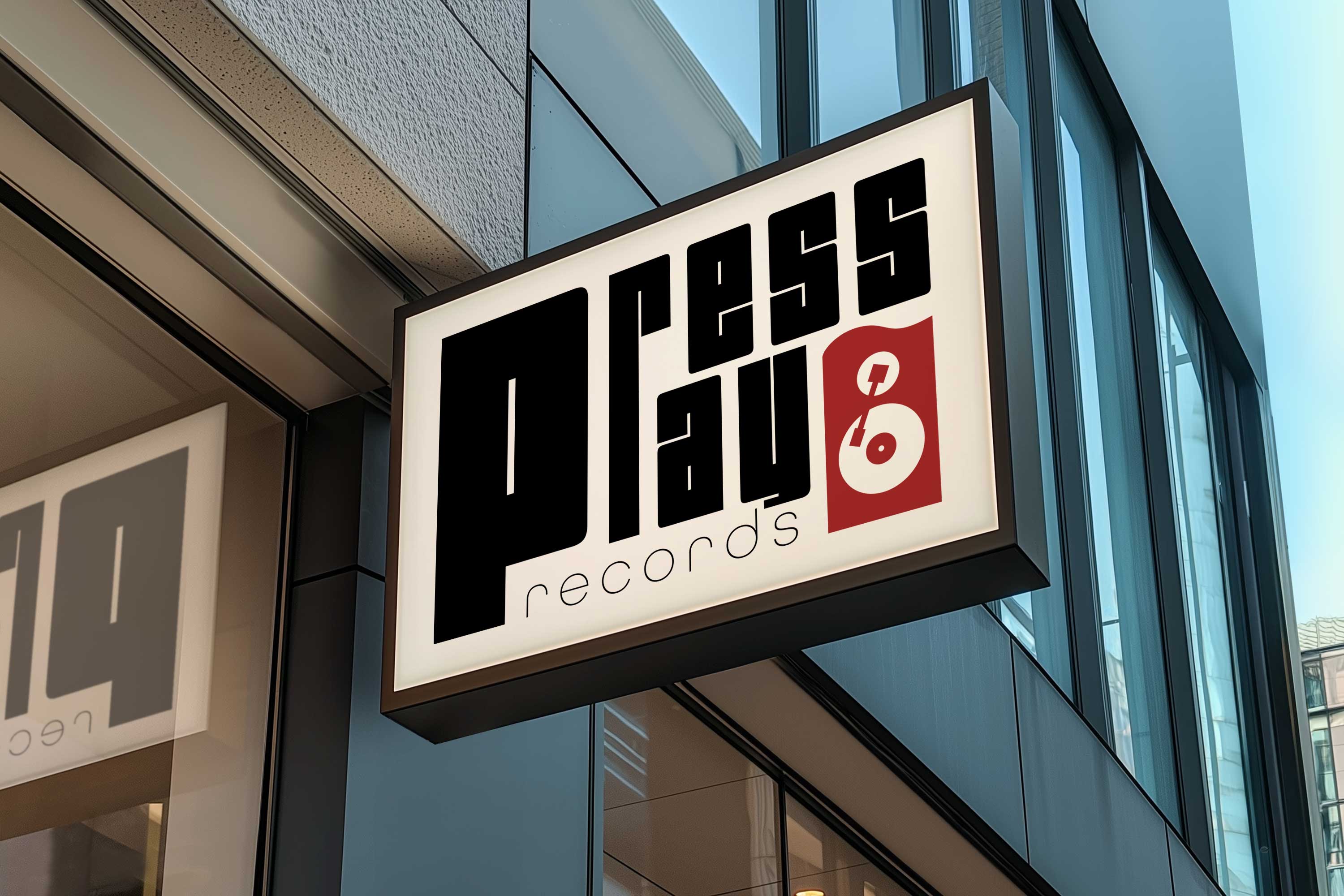
A blocky sign that perfectly frames the logo fits perfectly as a sign mockup that could stand just outside of the store.

18
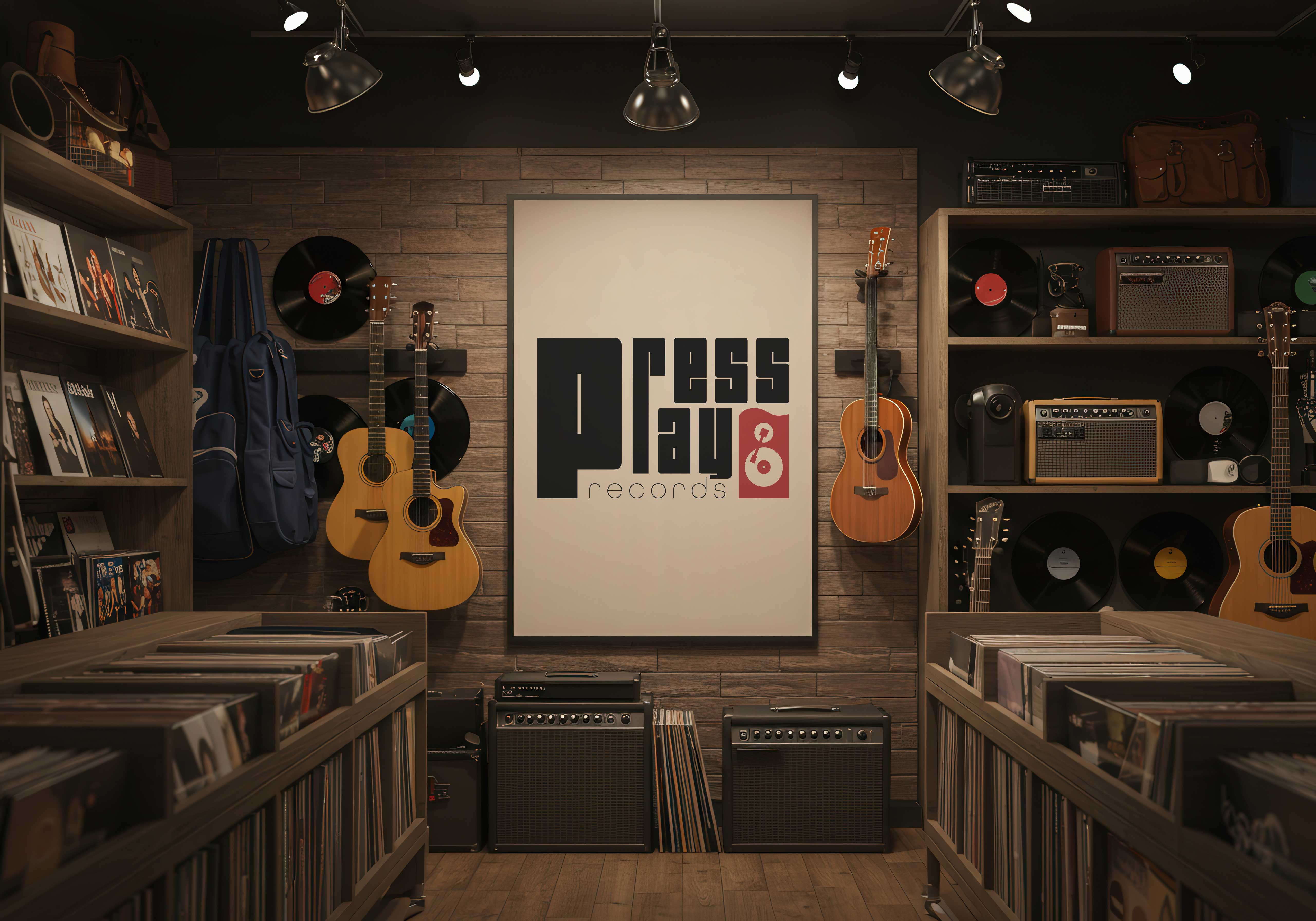
Poster Mockup
A poster mockup with a vinyl store atmosphere is the perfect display for a logo inside of the store.

19
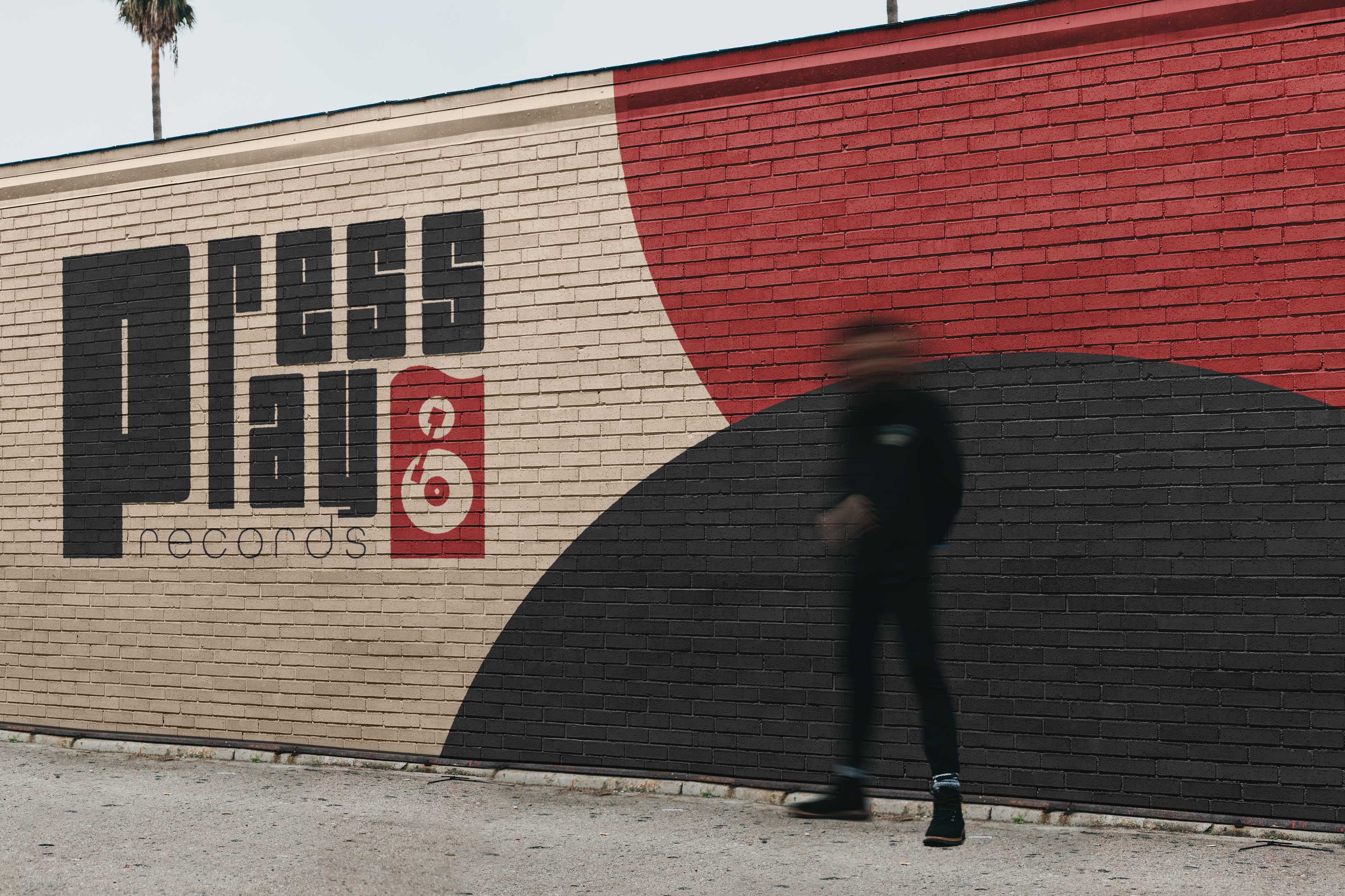
Building Mockup
An outdoor brick wall mockup with brand colors and a large logo, ready to be seen by all passerbys!

Want ads done for your brand?
Contact the designer below to get further information on ad campaign information!
bottom of page